Sunday 2 February 2014
Evaluation- question 3
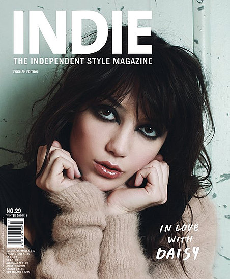
During my research period, one media institution that I looked at was 'Plastic Media'. This company distribution 'Indie' magazine- a product which focuses on a broad range of topics, including music, fashion, film and theater. This is the type of institution that I would want to distribute my product. I think this because Indie magazine takes quite a minimalistic approach to the media market. My product follows a similar style to Indie magazine, but has potential to appeal to a wider audience due to the more busy, conventional approach it takes in appearance. Institutions never want to take on a product exactly like what they already have- that would never make them enough money. However, differing the products slightly brings potential for a wider audience with varying genders, ages, styles and tastes.
Evaluation question 1
My product follows many conventions of a real media product. Many of these conventions have been used on the various pages. For example, my front cover consists of many features typical for a magazine; a masthead, a central image, coverlines, headlines and straplines. However in some ways my front cover does challenge the conventions of products in this genre. Many magazines I looked at during my reasearch that fitted into the indie/alternative genre kept minimalistic approach to the front cover's design. I decided to try and make my product more appealing to to a wider audience by making my appearance busier, so there would be more to look at (since there seems to be a gap in the market of this genre for this.)
My contents page and double page spread are very much conventional to the style I was hoping to achieve. I included just one image on my contents page, and copied the masthead to create continuity, very much like a lot of magazines I've researched do.
My double page spread took a more minimalistic approach, as in current products. I had one central image which bled across both pages, a headline, a pull quote, and the text, all of which played by conventions. The text was laid out in a way which also played by conventions- 4 columns running along the bottom of page. I decided to lay it out like this because I found that pages that don't fight to grab attention seem to have more success in gaining readership.
Finally, I decided to also keep conventions such as a consistent house style of 3 colours for my pallet, and around 6 different fonts of various sizes. I didn't want to overwhelm the person viewing my magazine by forcing too wide a variety for my house style, as that can put them off reading the magazine. Also, the genre that this magazine represents tends to be quite simplistic, which needs to be reflected.
Subscribe to:
Posts (Atom)